Competitor deep dive: Whop Commerce (Orix Studio)#
A look at the existing Whop Commerce Framer plugin and what it means for our Whop-ready lander templates and plugin. Same legend as the guide below: ✅ = seen on the official listing or docs · 📊 = estimate · 🧠 = inference or recommendation · ⚠️ = not found publicly ("not found" means it wasn't visible, not that it doesn't exist).
Age~3 weeks oldLaunch post dated "3w" ago, so around late Sep 2026 📊
PriceFreeNo paid tier or license visible ✅
DocsNone foundNo docs, demo site, changelog, or limitations ⚠️
AdsNot supportedNo pixel, analytics, ads, or lander building on the listing ✅
Young, free, thin. About 3 weeks old, free, with no docs, demo, or changelog and generic listing copy.
It covers the store side only: store connection, product sync, buy buttons, product cards, Whop checkout, Shippo for physical goods, and order monitoring.
No ads. It doesn't touch Whop Ads, the Whop pixel, lander or page generation, ad creative, spend caps, or A/B testing. That's where our paid tiers sit.
The big find: Whop publishes its own official @whop/framer package with an embedded checkout, so basic checkout is effectively a commodity.
Connect Whop store / manage multiple connected stores
Listed ✅
Product sync
Listed ("sync your products"). Not stated whether it syncs to Framer CMS
Buy Buttons, Product Cards (components)
Listed. These are the only named components
Digital products & subscriptions
Listed (Whop-powered checkout)
Physical goods via Shippo (fulfillment + shipping tracking)
Listed
Orders / checkout activity monitoring in plugin
Listed
Cart
Not mentioned ⚠️
Embedded vs redirect checkout
Not stated. Whop's official @whop/framer (WhopFramerCheckoutEmbed) makes either possible
Variants, inventory, multi-currency
Not mentioned ⚠️
Pixel / analytics / ads
Not mentioned
Docs, demo site, changelog, limitations
None found ⚠️
Technically (inferred 🧠): it likely uses Whop's Products/Plans endpoints, a checkout link or the @whop/framer embed, and Payments/Memberships for order views. Shippo is mentioned, but how it connects wasn't found.
The listing marks it Free ("Orix Studio·Free" in cross-listings). No paid tier or license is visible. ✅
Their sibling plugin, Commerce Toolkit, says "PRO — $0 one-time" and mentions "your Whop license", which hints at a planned Whop-sold license model. 🧠
Auth isn't documented. Whop's options are an Account API key (server-side only), an App API key for installed apps, or OAuth. A Framer plugin with no backend would most likely ask users to paste a key, or run its own server/OAuth. 🧠 Whether it's a Whop App Store app wasn't found. ⚠️
Plugins: Whop Commerce, Arvo Commerce (Odoo → Framer CMS sync, live about 2 weeks ago), CreemGate (Creem buttons and pricing tables; V2 adds memberships, gating, license keys), Commerce Toolkit (Stripe button, QR codes, countdown timer), Cookie PRO, Motion Importer (free), Remark (paid).
Activity is high: about 3 commerce plugins in roughly 3 weeks, and Whop promotions (e.g. Whop BNPL) in their feed. They position as a "commerce connectors for every processor" studio, so their Whop depth is likely shallow. 🧠
Contact: only via the Framer profile (Expert hire). No own site or X handle found. ⚠️
Whop ships its own official Framer package with an embedded checkout code component (WhopFramerCheckoutEmbed). Basic checkout is effectively a commodity, so we don't need Orix for it. The moat is ads, not checkout.
Build checkout ourselves on @whop/framer. Kit owns it, about 2–3 days (estimate). We own the full stack and don't depend on a third party.
Light co-marketing with Orix: mutual listing mentions, interop (our templates work with their components), and an affiliate cut on our All-Access pass.
Acquisition only if it gets traction. It's young, so it's possibly cheap, but there's little defensible tech. Revisit in 60–90 days if their plugin shows real traction. 🧠
Framer Template Guidelines — Designing, Building & Selling World-Class Framer Templates. The working instruction file for designing, building, listing, and growing Framer templates, written for humans and AI agents.
Owner: Maker Merchant · Audience: Maker + AI design/dev agents · Use as: the working instruction file for every Framer template project
Last verified: October 17, 2026 (Framer 3.0 era, after the June 16, 2026 Community/Marketplace relaunch)
Status legend: ✅ = verified on an official Framer page · 📊 = third-party data or creator report · 🧠 = recommended practice / informed opinion · ⚠️ = could not verify, check before relying on it
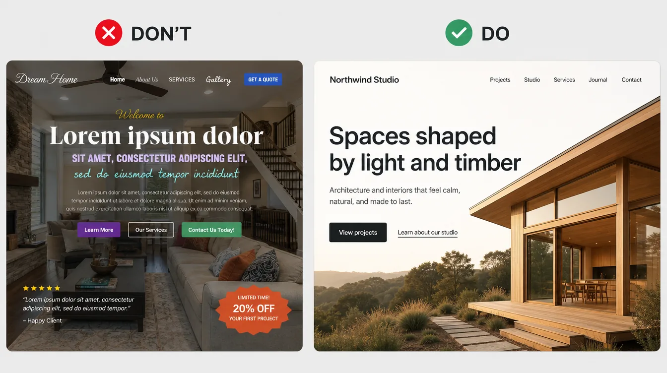
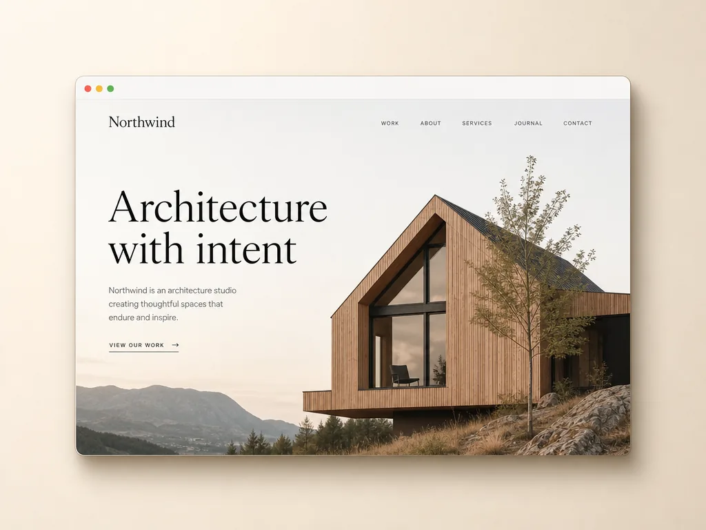
About this edition (added Oct 17, 2026): Everything in the original guide is kept word for word. Sections marked 🔎 Deep dive are additions: extra specs, do/don't tables, code, and naming examples. Facts in them were checked against official Framer docs on Oct 17, 2026 (marked ✅), and anything else keeps the same legend (🧠 / ⚠️). All UI pictures are AI-generated illustrative examples made with Magnific. They are not real templates, not Framer screenshots, and any brand names in them (e.g., "Northwind") are fictional.
There is no manual review anymore. Templates go live right away. Moderation and ranking decide who gets seen. Quality is now your job, not a reviewer's. ✅
Pick a niche buyer, not a generic layout. Generic landing pages lose to free templates and AI. Specific, polished, CMS-backed systems sell. ✅📊
Price with confidence. Median paid price is about $59. The most common price is $49. Premium agency/portfolio/SaaS/e-commerce templates sit at $99–$149. 📊
You keep 100% of sales, but you run checkout. Framer only links to your checkout page (Lemon Squeezy, Gumroad, Stripe, Contra…). Delivery, refunds, taxes, and support are yours. ✅
A live preview is required. It must be published from the same project you're selling. ✅
Build on a strict design system. Shared color and text styles everywhere, components with exposed properties, CMS for repeated content, layout templates for nav and footer. ✅
Responsive means fluid, not three snapshots. Drag-resize between breakpoints. No horizontal scroll, no fixed widths that break layouts. ✅
Make it AI-ready. Add Agent instructions and a template Skill (skills stay with the project when it's remixed). Use clean names, consistent styles, and organized CMS. ✅
Everything must be legally yours to distribute. That covers fonts, images, icons, client work, and code. You warrant this in the Community Terms. ✅
Ship a 404 page, page titles and descriptions, alt text, semantic tags, mailto:/tel: links, and no lorem ipsum. ✅
Motion should be purposeful and cheap. Use Appear effects above the fold, keep blur under 10, and respect reduced motion. ✅
Treat it like a product. Launch post, distribution outside Framer, fast support, regular updates, a catalog, and bundles. ✅📊
1.1 Framer 3.0 + the new Community (June 16, 2026) ✅#
Framer 3.0 launched with Agents (AI working directly on the canvas), Branching, and a new Community. The Community includes the Marketplace, Gallery, Awards, Social Feed, Members, and Contests.
Marketplace review is gone. In Framer's words: "resources will no longer go through a review process before they can be published." Moderation replaces reviewing. The team now curates what gets featured, improves ranking signals, and can act on items that are "low quality, broken, misleading, copied, or not useful."
Framer says the bar is going up, not down: "'Good enough to get accepted' will matter less. 'Good enough that people actually want it' will matter more."
Scale: more than 7,000 creators sell on the Marketplace. Framer paid creators $6.5M in 2025 (+200% YoY) and takes no revenue share.
Ranking signals: Discovery (views, unique visitors), Usage (remixes/opens/installs, unique users), Conversion (% of remixed templates that upgrade to a paid Framer plan), and Continued use.
Ranking views: Trending (momentum), Best (sustained performance over the chosen period), Recent (new items, where early performance still counts).
Free and paid are ranked together. Switching a template from free to paid resets its ranking.
Fake accounts or fake activity can get you banned from the Marketplace.
Marketplace Analytics launched September 25, 2026: a Performance tab plus Rankings.
Framer's position: AI makes strong templates more valuable, because the Agent needs a clear design system to build on. "Low-effort templates will be less competitive."
Template creators can add custom Agent instructions. Skills launched September 22, 2026, and they stay with a project when it's remixed. That means you can ship a focused template plus a skill that teaches the Agent how to extend it, instead of piling in dummy content.
Many blog posts, including some updated in September 2026, still describe a manual review queue with rejection feedback. That process is outdated as of June 16, 2026.
The old rejection reasons are still a useful quality bar (see 4.4), because the same problems now hurt you in ranking, refunds, and moderation.
Supply is huge. One tracker counted 2,689 new templates in eight weeks (July 29 to September 22, 2026), about 48 per day. Another snapshot counted 10,000+ templates in total. The portfolio category alone has about 3,100.
55% of new templates are free. Landing pages are free 74% of the time.
Category mix of new templates (keyword-sorted, rough): about 36% portfolio/creative and about 23% SaaS/tech.
Premium pricing clusters in commerce and SaaS. Among paid templates, 38% of e-commerce and 36% of SaaS templates cost $99+, compared with about 10–11% for restaurant and health/fitness.
Proven winners are catalogs, not one-offs. The strongest public revenue stories (Anatolii Dmitrienko, Hamza Ehsan, Cédric) come from multi-template catalogs, bundles, and referral income.
Look at similar templates before setting a price (Framer recommends this ✅).
Don't launch cheap and raise later "once it has reviews." Your price signals your quality tier.
Price in USD and end it in 9 to match marketplace norms.
The listing price MUST match the checkout price exactly ✅.
Launch discounts belong on your checkout platform, as a coupon with a clear end date. Remember the listing price has to match checkout. ⚠️ Confirm how Framer treats a discounted checkout price.
Note: under the Community Terms, Framer may run promotions on your content without prior notice ✅.
3.5 Buyer plan constraints (affects what you can sell) ✅#
Buyers have to publish on their own Framer plan. Disclose any requirements that exceed Basic:
Plan (yearly, per month)
Pages
CMS collections
CMS items
Notes
Free
(1,000 for building)
10 (build/try)
—
Free Framer domain only, 1 GB bandwidth
Basic $10
30
2
1,000
Custom domain, localization add-on
Pro $30
150 (expandable)
10 (expandable to 40)
2,500 (expandable)
Redirects, staging, Branching
🧠 Rule: If your template uses more than 2 CMS collections or more than 30 pages, say clearly in the listing and instructions that the buyer needs Pro to publish everything. Better yet, design it so the core site works on Basic (≤ 2 collections) and the extra collections are optional.
4.1 Hard requirements (listing won't work or breaks the rules without them) ✅#
Requirement
Source
Name, byline, description
How to publish a template
Images, categories, styles, features
How to publish a template
Live preview URL from a published project on a free Framer domain, from the same project you're selling
Adding a live preview
Remix URL
How to publish a template
Payment settings / checkout URL (paid only)
Accept payments
Checkout page: goes straight to payment, shows product + price, price matches listing, public with no login, includes a refund/cancellation policy
Accept payments
A valid support email, with support given "within a reasonable timeframe"
Community Terms §4.1
You own or have licensed every asset, with no third-party IP infringement and no malware
Community Terms §9.1
No unlockable features or functionality requiring payments through channels not disclosed to and approved by Framer
Community Terms §2.7
A privacy statement if your content collects or processes personal data
Community Terms §4.4
No fake activity or extra accounts
Analytics & rankings
4.2 Official best-practice checklist (Sept 15, 2026) ✅#
Framer calls these "not required" but says they improve discoverability and cut support load. Treat them as MUST anyway.
Originality: clear audience/use case; original, differentiated layouts; no reused or lightly modified templates; value beyond native Framer features.
Design: consistent styling; clear hierarchy; cohesive color/type/spacing; shared text and color styles throughout; custom 404 page; polished assets.
Layout: clear page purpose; layout templates where appropriate; Stacks, grids, and auto-height; no horizontal scrolling; layouts hold up as content changes.
Text: legible; spelling and grammar checked; Framer fonts where appropriate; balanced text with no orphans; no lorem ipsum or placeholder content.
Responsive: clean on mobile/tablet/desktop; no fixed sizes that break; components adapt; readable on small screens.
Links:mailto: and tel:; clickable things look clickable; hover and active states; no broken or inactive links.
CMS: repeated content in CMS; fields clearly connected; empty and unused entries removed; clear naming.
Code: clean, minimal; native features first; embeds only when necessary; maintained and compatible.
Template name: short, brandable, unique within the Marketplace. Search it first. Avoid trademarks such as "Apple" or "Notion."
Byline/title for search: say what it is. Framer's example: "SaaS Landing Page Template" beats a generic project name. Include terms buyers search for ✅.
You can edit listing details and the template project at any time ✅.
The live preview reflects your latest publish ✅. Republish the preview project after every update.
A remix creates an exact copy at the moment it's copied ✅. 🧠 So existing buyers don't get your updates automatically. They'd need to re-remix from your link and move their content over.
🧠 Versioning conventions:
Keep a Changelog section on the Instructions page and the listing: v1.2.0 — 2026-11-03 — Added Dynamic Filters to Work page.
Use semantic versioning: MAJOR (structure changes), MINOR (new pages/features), PATCH (fixes).
Keep a master project (source of truth). Use Branching (Pro) to stage updates before merging ✅ (Branching exists; using it for templates is a recommendation).
Email buyers about MINOR/MAJOR updates with the remix link and "what changed."
5.1 What the Community Terms say (v1.0, effective June 1, 2026) ✅#
You keep ownership of your Creator Content.
You grant Framer a worldwide, non-exclusive, royalty-free license to host, display, distribute, and promote your content. Framer may also use and adapt it to market Framer and for educational purposes, without extra compensation.
Framer may build competing products (§2.5).
You warrant you own or have licensed everything and nothing infringes third-party IP or publicity/privacy rights (§9.1).
You indemnify Framer against claims arising from your content, buyer disputes, and taxes (§10).
Support is your responsibility, with a valid support email and timely responses (§4.1).
Buyer disputes (refunds, chargebacks, licensing) are between you and the buyer (§4.3, §6.3).
Taxes: you handle them yourself (§6.2). Framer doesn't withhold.
🧠 Restate these in plain words on your Instructions page and checkout page ("One license = one website. Need more? Buy another license or the bundle.").
5.3 Asset licensing matrix 🧠 (verify each source's license)#
Asset
Safe
Risky / avoid
Fonts
Google Fonts (via Framer's Google tab), Fontshare fonts (Framer's Fontshare tab), Inter/Inter Display ✅ (all built into Framer)
Uploading paid or commercial fonts into a template you redistribute. Buyers would get the font file without a license. If you must use one, use a free fallback and tell buyers how to license and swap
Photos
Your own photography; licensed stock whose terms allow use in redistributed templates; AI images where the tool's terms grant commercial rights
Editorial-only stock; photos of recognizable people without model releases; client photos without written permission ✅ (Framer requires permission for client work)
AI images
Generic scenes, objects, abstract art; keep a record of the tool and its terms
Lookalikes of real people, brands, logos, copyrighted characters
Icons
Framer's built-in icon sets (e.g., Phosphor, Material, Feather, available in Framer), MIT/ISC/OFL icon libraries, your own SVGs
Icon packs with "no redistribution" clauses
Logos (social proof strips)
Fictional logos you designed
Real company logos (implies endorsement, trademark risk)
Video
Your own footage, properly licensed stock, AI video with commercial rights
Music tracks without sync rights
3D / Spline / Lottie
Your own, or CC0/licensed with redistribution rights
Your own, or free components whose license allows inclusion
Paid Marketplace components (buyers didn't license them). Under the paid license, buyers may not redistribute them, and you can't either
⚠️ Unsplash/Pexels-style licenses generally allow commercial use but restrict compiling photos into competing services. Many top creators use their own or AI imagery to avoid ambiguity. Read the current terms yourself.
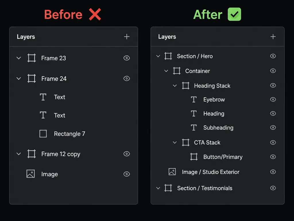
Framer's guidance: assets in clearly named folders, descriptive file names, no duplicates ✅. The Tidy up skill in Framer's Skills Index can auto-name layers and remove hidden or unused leftovers ✅.
Element
Convention
Example
Section
Section / [Purpose]
Section / Hero, Section / Testimonials
Container (max-width wrapper)
Container
Container
Stack
[Purpose] Stack
Heading Stack, CTA Stack
Grid
[Purpose] Grid
Features Grid
Text
Its role
Heading, Subheading, Body, Eyebrow, Label
Image
Image / [Subject]
Image / Team Photo
Component (master)
[Category]/[Name]
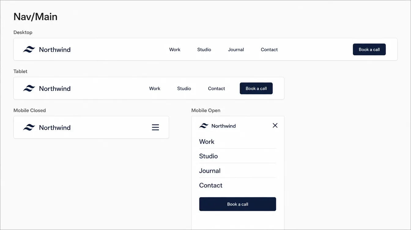
Button/Primary, Card/Project, Nav/Main
Variant
State or size, Title Case
Default, Hover, Pressed, Mobile, Open
Component property
Plain-English, buyer-facing
Label, Link, Show Icon, Image
Rules:
Zero default names (Frame 23, Text, Rectangle) in the shipped project.
Delete hidden layers that serve no purpose. Hidden-for-breakpoint layers are fine but should be named, e.g., Nav Desktop / Nav Mobile.
Delete unused components, styles, images, code files, and pages.
Order layers top-to-bottom in the same order they render.
🔎 Deep dive — a fully named layer tree 🧠
AI illustrationFigure: Layers panel before and after naming — AI-generated illustrative example (Magnific), not a real template or Framer screenshot.
Goal: a buyer can rebrand the whole site by editing ~5 color styles and 2 font families. Framer's best practices require "shared text and color styles used throughout." ✅
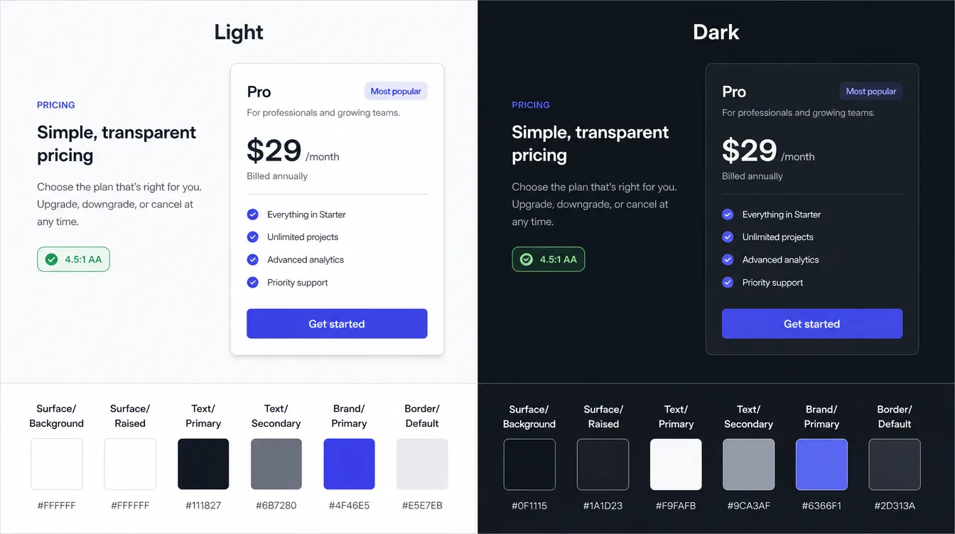
Light/dark mode ✅: Color styles can hold a light and a dark value. The published site follows the visitor's device appearance. Text styles can use themed color styles. Works on CMS pages and in animations. Preview both on the canvas (⌃⌘N toggles canvas theme). Remove a dark value through Assets → ••• → Remove Dark Style.
🧠 If you ship dark mode, test contrast in both modes. If you don't, make sure no color style has a stray dark value.
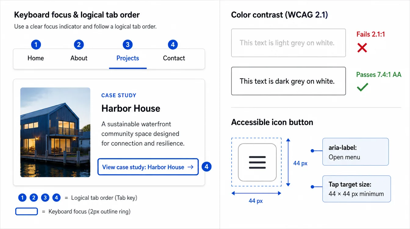
🧠 Contrast targets: body text ≥ 4.5:1, large text (≥ 24px, or ≥ 18.66px bold) ≥ 3:1, UI boundaries/focus ≥ 3:1 (WCAG 2.2 AA).
🔎 Deep dive — light/dark color styles in practice
AI illustrationFigure: One set of semantic color styles, two appearances — AI-generated illustrative example (Magnific), not a real template or Framer screenshot.
🧠 Example token sheet (values are just a starting point; the names are what matter):
Style
Light
Dark
Check
Surface/Background
#FAF8F5
#121212
—
Surface/Raised
#FFFFFF
#1C1C1E
Visible edge vs. background (add Border/Default if not)
Text/Primary
#141414
#F4F2EE
≥ 4.5:1 on both surfaces
Text/Secondary
#57534E
#A8A29E
≥ 4.5:1 on Background and Raised
Brand/Primary
#1F3A2E
#9FD3B5
Brand/On Primary text ≥ 4.5:1 on it
Border/Default
#E7E2DA
#2C2C2E
Decorative only
Border/Strong
#A8A29E
#6B6B70
≥ 3:1 for inputs/focus (UI boundary)
Workflow 🧠: define the light value, add the dark value on the same style, then toggle the canvas theme (⌃⌘N ✅) and walk every page once. Any element that looks wrong in dark mode is almost always a hard-coded color.
Text styles automatically get semantic tags (h1–h6, p), which you can override per instance in the Accessibility panel ✅.
Recommended scale. Framer's own Skills example uses H0–H6, Body L, Body, Body M, Button ✅:
Style
Tag
Desktop
Tablet
Phone
Line height
Use
Display (H0)
h1
80–112
64–80
44–56
1.0–1.05
Hero only
H1
h1
56–64
48
36–40
1.05–1.1
Page titles
H2
h2
40–48
36
28–32
1.1–1.15
Section titles
H3
h3
28–32
26
22–24
1.2
Card/sub-section titles
H4
h4
22–24
20
20
1.25
Small headings
H5/H6
h5/h6
18/16
18/16
16/15
1.3
Rare
Body L
p
20
18
18
1.5
Lead/intro
Body
p
16–18
16–17
16
1.55–1.65
Main copy
Body S / Body M
p
14
14
14
1.5
Meta, captions
Label/Eyebrow
p
12–14, uppercase optional, +tracking
same
same
1.2
Tags, eyebrows
Button
p
15–16, medium/semibold
same
same
1
Buttons only
🧠 Set per-breakpoint sizes inside the text style so tablet/phone sizes come from the system, not from manual overrides on each layer ⚠️ (check that the current Framer UI supports breakpoint values in your text style. If it doesn't, override consistently and document it).
Turn on text balance for headings, and check for orphans ✅ ("balanced to avoid awkward line breaks and orphans"). Framer's skill example sets "Text Balance to Yes" ✅.
Line length: 50–75 characters, target ~65 (Framer's Skills example) ✅.
🔎 Deep dive — text-style breakpoints (verified)
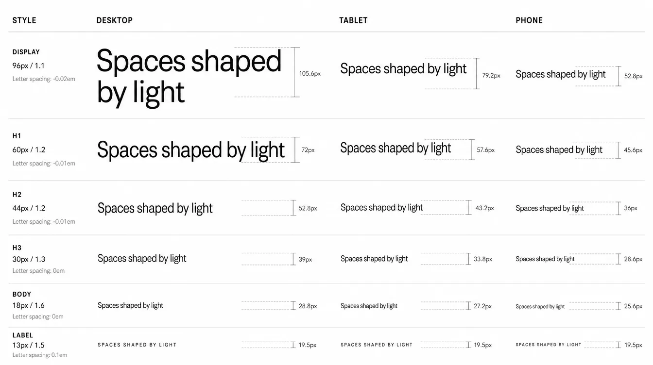
✅ Update (Oct 17, 2026): Framer's Help Center article Setting Text Styles breakpoints (updated March 3, 2026) confirms text styles can hold breakpoint values: Assets → Styles → select a text style → Breakpoints → Add Breakpoints adds Desktop (L), Tablet (M), Mobile (S), and each can set font size, line height, letter spacing, and paragraph spacing. So the 🧠 rule above ("set per-breakpoint sizes inside the text style") is supported. The original ⚠️ note is kept for history; see also the update under 29.
AI illustrationFigure: One text-style scale with L / M / S breakpoint values — AI-generated illustrative example (Magnific), not a real template or Framer screenshot.
🧠 A concrete scale you can paste into a brief (px; line height as a multiplier):
Style
L (Desktop)
M (Tablet)
S (Phone)
Line height
Letter spacing
Display
96
72
48
1.0
−0.03em
H1
60
48
38
1.05
−0.02em
H2
44
36
30
1.1
−0.02em
H3
30
26
22
1.2
−0.01em
H4
22
20
20
1.25
0
Body L
20
18
18
1.5
0
Body
17
17
16
1.6
0
Body S
14
14
14
1.5
0
Label
13
13
12
1.2
+0.06em, uppercase
Button
15
15
15
1.0
0
Rule of thumb: each heading level is ~1.25–1.35× the next one on desktop and ~1.2× on phone, so the hierarchy holds without the phone headings getting huge.
⚠️ Framer doesn't have dedicated spacing tokens the way it has color/text styles (as of this writing, unverified). Enforce the scale through components (section and container components with fixed padding/gap) and by writing it into the template Skill (Section 21).
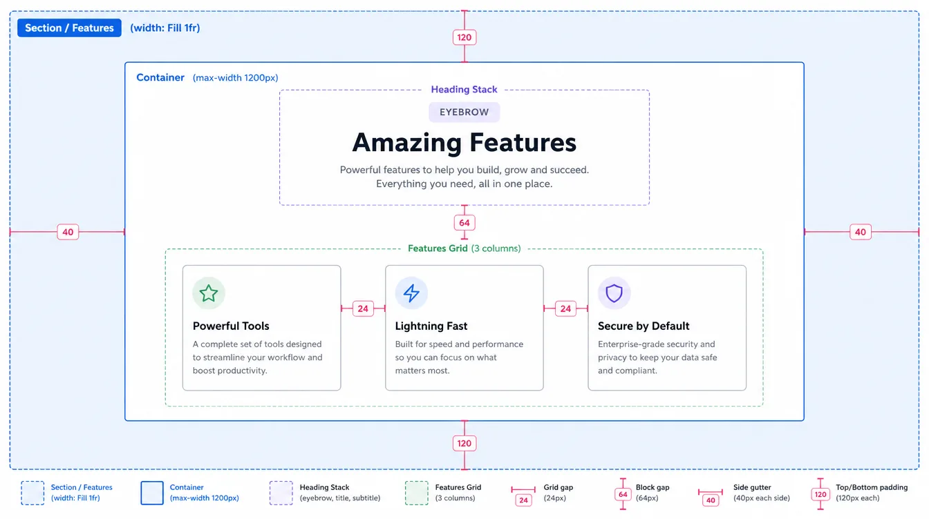
Section pattern (from Framer's Skills example ✅): sections fill screen width (1fr) and contain an inner wrapper with max-width: 1200px holding the content.
Columns: 12-column mental model on desktop, 8 on tablet, 4 on phone. Build real layouts with Stacks and Grid (Section 8).
🔎 Deep dive — section anatomy with real numbers
AI illustrationFigure: Section / Container anatomy with spacing redlines — AI-generated illustrative example (Magnific), not a real template or Framer screenshot.
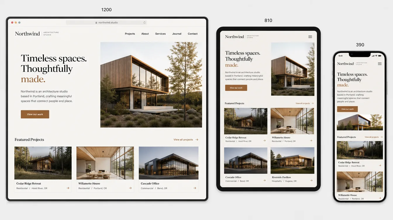
Framer's default breakpoints are Desktop 1200, Tablet 810, Phone 390 ⚠️ (widely documented in Framer Community/lessons. Confirm in your project). The breakpoint value is the minimum width for that breakpoint. Desktop is primary, and smaller breakpoints inherit from it with overrides.
🧠 Add a Large Desktop (1440+) breakpoint only if the design really changes there (e.g., wider container). Otherwise rely on max-width containers.
🧠 Design desktop first, then tablet, then phone. Override as little as possible. Every override is something buyers have to edit three times.
✅ Framer Academy: preview at wide, medium, and narrow widths, then drag-resize between those points. Flexible sizing problems often show up between breakpoints.
Layout templates support breakpoints, e.g., swapping desktop nav for a hamburger on mobile ✅.
🔎 Deep dive — breakpoint planning table
✅ Verified Oct 17, 2026: Framer's Help article Using pages says Framer "uses a desktop-first workflow, with a default desktop width of 1200 pixels." Framer Academy's breakpoints lesson says the width shown is "the minimum viewport width at which that breakpoint becomes active," that new breakpoints inherit from the primary one, and that you should add a breakpoint "when the layout starts to fail, rather than adding one by habit." Tablet 810 / Phone 390 are the presets Framer suggests (stated by Framer staff on the Framer Community forum), so the ⚠️ above is now low-risk, but still check a new project.
Breakpoint
Active from
Typical container
Grid columns
Nav
What usually changes
Desktop (primary)
1200px
1200 max
3–4
Full links + CTA
— (source of truth)
Tablet
810px
Fill, 32 gutters
2
Fewer links or hamburger
Grid columns, section padding, some Stack directions
Phone
390px (renders down to 0)
Fill, 16–20 gutters
1
Hamburger (Mobile Closed/Open)
Stack direction, type (via text-style S), hide decorative art
Large (optional)
1440px+
1360–1440
4
Same as Desktop
Only if the composition really changes
AI illustrationFigure: Responsive trio at Framer's default breakpoint widths — AI-generated illustrative example (Magnific), not a real template or Framer screenshot.
Every horizontal Stack has a phone plan: wrap, switch to vertical, or deliberately scroll horizontally (carousel, with visible affordance).
Tap targets on phone ≥ 44×44 px.
Body text never below 16px on phone.
Hide/show per breakpoint only for navigation and truly different compositions. Prefer a single responsive layer.
Check that the phone nav menu opens, closes, locks correctly, and that links close the menu.
Test real long content: 2× longer headings, a 3-line button label in German, an empty CMS field.
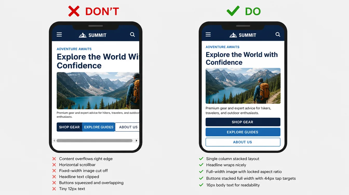
Check the overflow at 320px. Nothing may cause a horizontal scrollbar ✅.
🔎 Deep dive — the 320px overflow test
AI illustrationFigure: Phone overflow, DON'T vs DO — AI-generated illustrative example (Magnific), not a real template or Framer screenshot.
Common overflow causes and fixes 🧠:
Symptom at 320px
Usual cause
Fix
Horizontal scrollbar
A child with a fixed width (e.g., 400px image or card)
Width Fill + max width; lock aspect ratio
Clipped headline
Long unbreakable word at Display size
Smaller S value in the text style; text balance on
Squeezed button row
Horizontal Stack with no phone plan
Phone override: Stack direction vertical, buttons Fill
Section wider than screen
Absolute-positioned decoration sticking out
Parent overflow hidden, or hide the decoration on phone
Marquee pushes layout
Ticker without clipping
Parent overflow hidden
Width sweep 🧠: drag the canvas preview from 1920 → 320 slowly and stop at every point where something jumps. Each jump is either a missing breakpoint value or a fixed size.
Framer's font sources: Google Fonts, Fontshare, custom uploads, open-source fonts, and Inter/Inter Display (the default) ✅.
Prefer Google Fonts. They load faster thanks to automatic subsetting ✅.
Use weights Light (300) to Extra Bold (800). Text in those weights uses font-display: swap with size-adjusted fallbacks, so it isn't invisible while loading ✅. Thin (100) and Black (900), and non-serif/sans categories such as display/handwriting from Google/Fontshare, don't get swap under the Auto setting ✅.
Custom fonts are converted to WOFF2 (except uploads from before November 2023, which you should re-upload) ✅.
Font Loading setting: Site Settings → Performance → Font Loading (Auto default / Always / Never) ✅. Leave it on Auto.
Components with clear properties are the main difference between "pretty" and "easy to customize." That's what reduces support and earns repeat buyers. Framer lists reusable components as a core trait of AI-ready templates ✅.
Transitions: 150–300ms ease-out for hover. Springs for open/close. Keep them consistent across components.
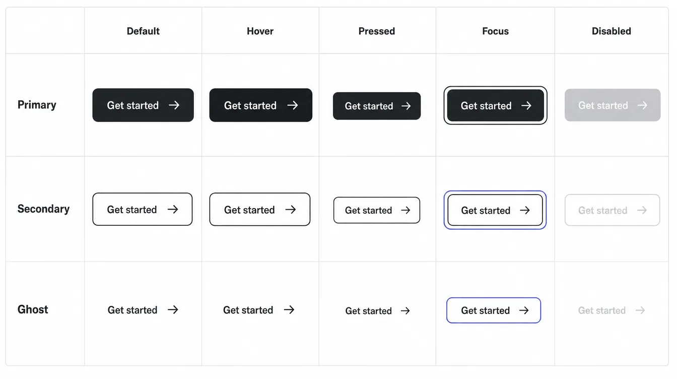
🔎 Deep dive — state matrix and nav variants
AI illustrationFigure: Button/Primary, Secondary, Ghost × five states — AI-generated illustrative example (Magnific), not a real template or Framer screenshot.
State
Visual change 🧠
Transition 🧠
Default
Base fill from Brand/Primary
—
Hover
Fill Brand/Primary Hover (or −8% lightness), optional icon nudge 2–4px
150–200ms ease-out
Pressed
Scale 0.97–0.98
100ms
Focus
2px outline in Border/Strong or brand, 2px offset, never removed
Instant
Disabled
40–50% opacity, no hover, not-allowed cursor
—
AI illustrationFigure: Nav/Main variants — AI-generated illustrative example (Magnific), not a real template or Framer screenshot.
Mobile menu behavior checklist 🧠: the hamburger is a real button with an accessible name ("Open menu"); Mobile Open covers the page and stops content behind it from being reachable; every link in Mobile Open switches back to Mobile Closed on tap; the close button sits where the hamburger was.
Expose what a buyer will actually change, and nothing else.
Component
Expose
Don't expose
Button
Label, Link, Variant, Show Icon, Icon
Padding, radius (system-level)
Project card
Image, Title, Category, Link (or bind to CMS)
Hover animation internals
Testimonial
Quote, Name, Role, Avatar
Layout
Section header
Eyebrow, Title, Subtitle, Show Eyebrow, Align
Font sizes
Pricing card
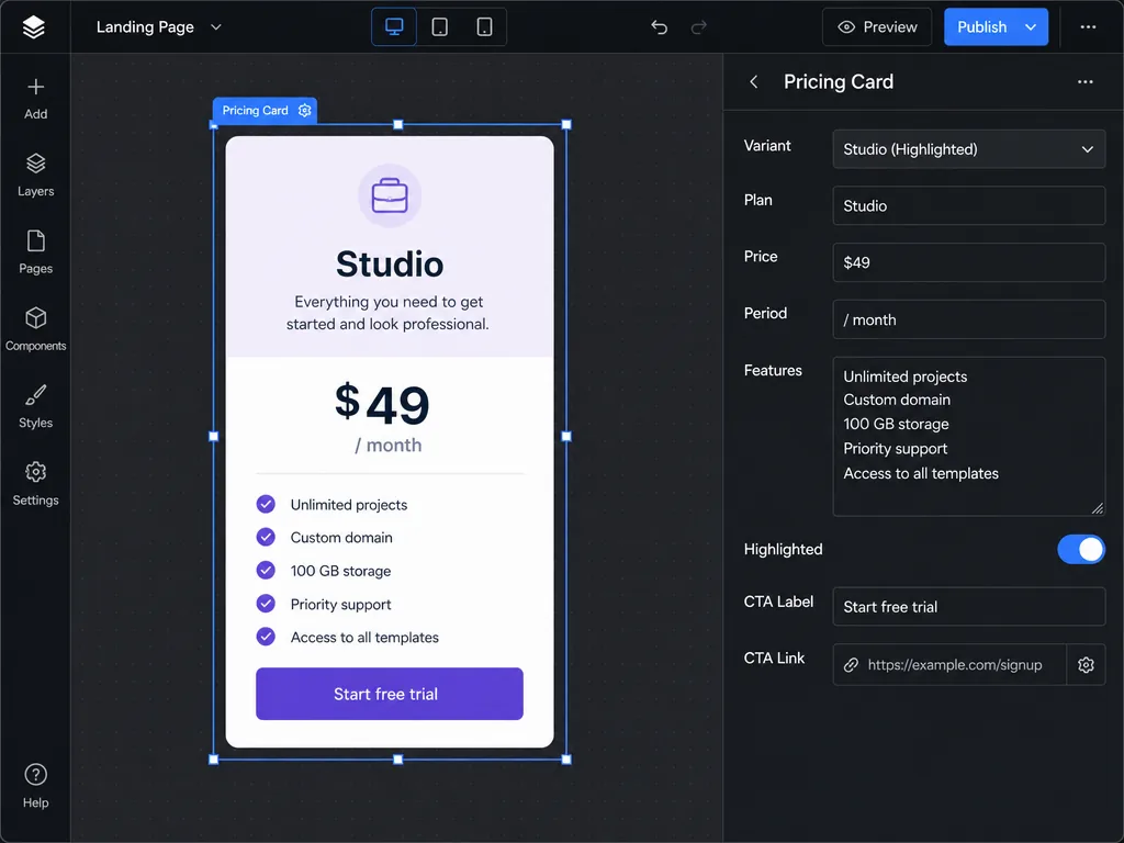
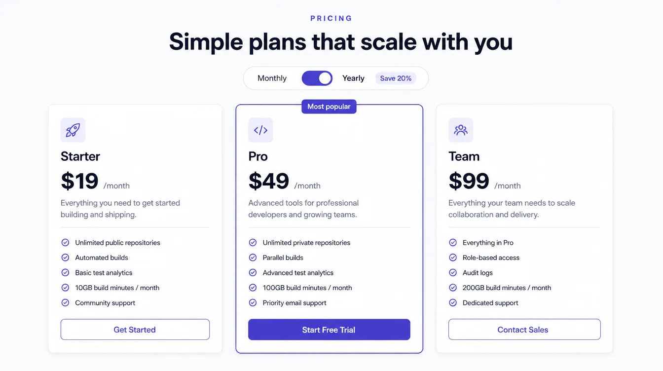
Plan, Price, Period, Features (text), Highlighted (boolean), CTA Label, CTA Link
Rules:
Property names are buyer-facing English: Show Icon, not iconVis.
Give every property a sensible default that looks great untouched.
Use booleans for optional elements (Show Badge) instead of separate variants.
Link properties should accept page links and URLs.
🔎 Deep dive — what a good properties panel looks like
AI illustrationFigure: Buyer-facing component properties — AI-generated illustrative example (Magnific), not a real template or Framer screenshot.AI illustrationFigure: Pricing section built from one Card/Pricing component with Highlighted = on for the middle plan — AI-generated illustrative example (Magnific), not a real template or Framer screenshot.
❌ Property name
✅ Property name
Type
txt1
Title
Text
isVis
Show Badge
Boolean (toggle)
bgImg
Image
Image
href
Link
Link
v
Style (Primary / Secondary / Ghost)
Variant
hl
Highlighted
Boolean
Test 🧠: hand the component to someone who has never seen it. If they can't change every visible piece of content from the right panel within a minute, a property is missing or badly named.
Write like a real business in the niche. Use real-sounding services, prices, case-study outcomes, team roles, and FAQs. Buyers judge fit by how well your copy describes their business.
Invent a coherent fictional brand (name, logo, voice) for the demo. Avoid real brands.
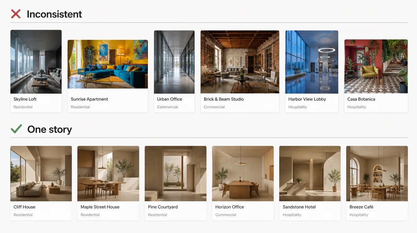
Images tell one story. Same color grade, same lighting, same crop logic. Inconsistent stock is the fastest way to look cheap.
Use AI imagery for consistency where useful. Keep a ledger of tool + license (5.3). Avoid generated people with distorted hands or text artifacts. Check every image at 100%.
Aspect ratios: standardize (e.g., 4:3 for cards, 16:9 for heroes/case-study covers, 1:1 for avatars, 3:4 for portraits). Lock ratios in components so buyer swaps don't break layouts.
Upload source images unmodified, at sufficient resolution (up to 4096px longest side is used). Framer generates 512/1024/2048/4096 variants and serves AVIF/WebP automatically ✅. Don't pre-convert.
Keep source files reasonable: ~2400–3200px longest side for full-bleed heroes, ~1600px for cards 🧠. Framer caps variants at 4096 ✅, and it never upscales ✅.
Upload SVGs as image fills (frame → Fill → Image) for complex graphics ✅.
🔎 Deep dive — writing an art-direction spec
AI illustrationFigure: Imagery: inconsistent vs one story — AI-generated illustrative example (Magnific), not a real template or Framer screenshot.
🧠 Put a one-paragraph spec in the asset ledger before generating or shooting anything, and reuse it for every image:
text
Art direction — Northwind (fictional)
Subject: calm architecture and interiors, no people in heroes
Light: soft natural daylight, late afternoon, no hard flash
Grade: warm neutrals, lifted blacks, low saturation (timber, linen, stone)
Lens/framing: eye-level, straight verticals, 35–50mm feel, subject off-center
Ratios: cards 4:3, heroes 16:9, portraits 3:4, avatars 1:1
Never: text in images, logos, recognizable real buildings or people, heavy vignettes
Manage repeated content through the CMS. Connect fields clearly to pages and components. Remove empty/unused entries. Use clear naming for collections and fields ✅.
Dynamic Filters (February 19, 2026): Search, Tabs, Toggles, Dropdowns, Checkboxes on Collection Lists. Works with Empty States and Pagination. Uses auto-created page variables ✅.
Dynamic SEO: {{Title}}, {{Description}} in CMS page settings. CMS image field as the social preview ✅.
Title, Slug, Client, Category (option or reference), Year, Cover Image, Cover Alt, Summary (plain text), Body (rich text), Gallery (images), Featured (toggle), SEO Title, SEO Description
Blog/Posts
Title, Slug, Date, Author (reference), Category (reference), Cover Image, Cover Alt, Excerpt, Body, Featured, SEO Title, SEO Description
Authors/Team
Name, Slug, Role, Photo, Photo Alt, Bio, Social links
Categories
Name, Slug, Description, Color (if used)
Services/Features
Title, Slug, Icon, Summary, Body, Order (number)
Jobs/Careers
Title, Department, Location, Type, Apply Link, Body
Testimonials (optional)
Quote, Name, Role, Company, Avatar
Rules:
Field names in Title Case, plain English. Add field descriptions where the purpose isn't obvious.
Fill every collection with 6–9 realistic items: enough to show grids, pagination, and filters, without forcing buyers to delete 40 entries. Framer's Skills post explicitly pushes creators away from "dozens of CMS entries" toward focused starting points plus Agent skills ✅.
No empty or test items ✅.
Mind plan limits: Basic allows only 2 collections, Pro 10 ✅. 🧠 Prefer fewer collections. Use option fields instead of a separate Categories collection where you can. Disclose if more than 2 are needed.
Every detail page (/work/:slug) must have dynamic title, description, and social image bound ✅.
Design empty states for filtered lists ✅ (supported) and handle optional fields with visibility conditions (e.g., hide Gallery section if empty) 🧠.
Link "Next project / Related posts" via filters or references for depth and internal linking.
🔎 Deep dive — CMS pages and filters, illustrated
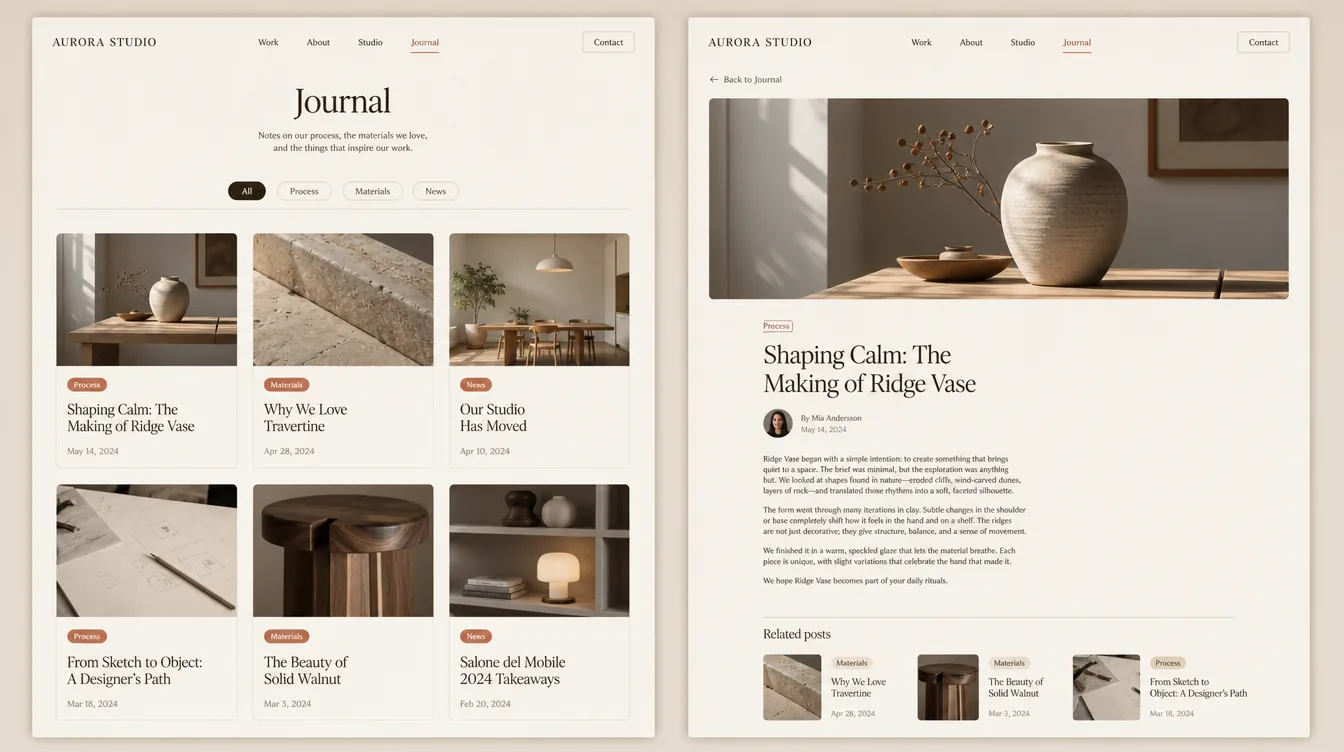
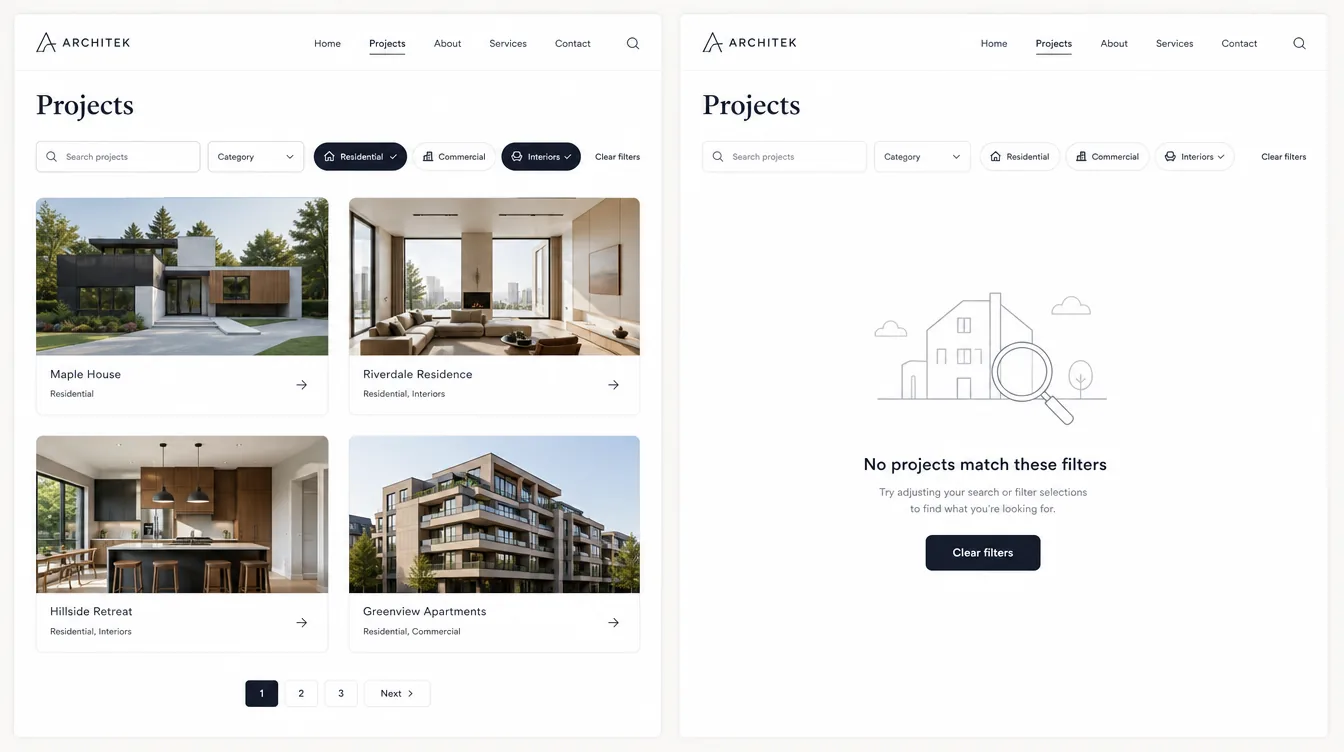
AI illustrationFigure: Blog index + detail from one Posts collection — AI-generated illustrative example (Magnific), not a real template or Framer screenshot.AI illustrationFigure: Dynamic Filters with designed empty state — AI-generated illustrative example (Magnific), not a real template or Framer screenshot.
🧠 Example field schema for a Posts collection (types as named in Framer's CMS field picker; check names in your version ⚠️):
Field
Type
Required
Bound to
Title
Plain text
✅
h1, card title, {{Title}} meta
Slug
Slug (auto from Title)
✅
URL /blog/:slug
Date
Date
✅
Card meta, article meta
Category
Option (or Reference to Categories)
✅
Tag, Dynamic Filter tabs
Author
Reference → Authors
—
Byline (hide if empty)
Cover Image
Image
✅
Card, hero, social image
Cover Alt
Plain text
✅
Image alt
Excerpt
Plain text (≤ 160 chars)
✅
Card, {{Description}} fallback
Body
Formatted text
✅
Article body (max-width ~720)
Featured
Toggle
—
Home "Featured" list filter
SEO Title / SEO Description
Plain text
—
Page settings meta (fallback to Title/Excerpt)
Using Option for Category instead of a Categories collection keeps the template at 2 collections (Posts + Projects), so it publishes on Basic ✅ (plan limits in 3.5).
Motion is purposeful and guides attention. Avoid excessive or overly complex animation. Keep performance in mind ✅.
Use Appear effects for key elements at the top of the site. They load before JavaScript. Avoid scroll animation effects for these above-the-fold elements ✅.
Shadows and blurs slow down animation and scrolling. Keep blur values below 10 ✅.
Layout templates support shared page transitions and layout animations ✅.
Respect reduced motion: Framer's site setting disables parallax, transform, and layout animations for users who prefer reduced motion ✅.
Custom code should be clean, minimal, and easy to understand. Use native features first. Use embeds only when necessary. Keep code compatible with current Framer ✅.
"You might not need Code Overrides." Native replacements: animating text/layers → Effects, user interactions → Components, dynamic data → Fetch ✅.
Overrides must be React 18 compatible and use forwardRef so effects and links keep working. Always spread existing props ✅.
Code components expose settings through addPropertyControls and ControlType. Also set defaultProps ✅.
✅ Use code for: a feature Framer can't do natively (e.g., live currency toggle, interactive calculator, specialized media), and only when it's essential to the template's value.
❌ Don't use code for: hover effects, reveals, carousels/tickers (native or official components exist), tracking scripts the buyer should add themselves, anything that breaks when the buyer edits the canvas.
14.3 Safe-code rules (adapted from Framer's component review checklist) ✅#
Static rendering: use useIsStaticRenderer() so animations and browser behavior don't run on the Canvas or in exports. Don't rely on typeof window. Nothing runs at module level.
Remove unused code, resolve TypeScript errors, handle empty and error states.
Pause work off-screen: rAF loops, timers, media, WebGL. Clean up on unmount.
Limit external dependencies: bundle deps. No remote script loading. Validate URLs from property controls. Disclose any required external service.
Accessibility: native <button>/<a>, alt text, visible focus, labeled inputs, accessible names on icon buttons.
Scope DOM changes to the component. Never touch document.body/head, global styles, or page-wide observers.
Performance: no continuous loops, short polling, full-DOM scans, or listeners added each render.
Accurate property controls: test each one, use clear titles/descriptions, sensible ranges, hidden() for irrelevant controls, and keep defaults in sync with code.
No unsafe HTML: no dangerouslySetInnerHTML with configurable or external content.
Add scripts only where needed. Use page-level code for page-specific scripts.
Use defer (or async when it must load ASAP). Never neither ✅.
🧠 Ship templates with no analytics or tracking scripts of your own (they'd send buyers' visitor data to you, which raises privacy issues under §4.4). Document where buyers can add theirs.
Sizing is set with @framerSupportedLayoutWidth / @framerSupportedLayoutHeight (auto, fixed, any, any-prefer-fixed; default any) and @framerIntrinsicWidth / @framerIntrinsicHeight, on the lines directly above the component. Spread style on the root so fixed sizing works.
For animated components, use useIsStaticRenderer() (static on Canvas and Export) instead of RenderTarget.
Override that adds safe external-link attributes (pattern from 14.5, React 18 + forwardRef + spread props ✅):
import{addPropertyControls,ControlType}from"framer"/** * @framerSupportedLayoutWidth any-prefer-fixed * @framerSupportedLayoutHeight auto * @framerIntrinsicWidth 360 */exportdefaultfunctionBadge({label,tone,showImage,image,style}){constcolors={neutral:"#EEE",success:"#DCFCE7",warning:"#FEF3C7"}return(<divstyle={{display:"flex",gap:8,alignItems:"center",padding:"6px 10px",borderRadius:999,background:colors[tone],...style}}>{showImage&&image?.src&&(<imgsrc={image.src}srcSet={image.srcSet}alt={image.alt??""}width={20}height={20}style={{borderRadius:999}}/>)}<span>{label}</span></div>)}Badge.defaultProps={label:"New",tone:"neutral",showImage:false}addPropertyControls(Badge,{label:{type:ControlType.String,title:"Label",maxLength:24},tone:{type:ControlType.Enum,title:"Tone",options:["neutral","success","warning"],optionTitles:["Neutral","Success","Warning"],displaySegmentedControl:true,},showImage:{type:ControlType.Boolean,title:"Show Image"},image:{type:ControlType.ResponsiveImage,title:"Image",description:"Square image, at least 40×40.",hidden:(props)=>!props.showImage,},})
Static-safe, off-screen-paused, reduced-motion-aware animation loop (✅ useIsStaticRenderer; 🧠 IntersectionObserver + prefers-reduced-motion are standard web APIs):
tsx
import{useEffect,useRef}from"react"import{addPropertyControls,ControlType,useIsStaticRenderer}from"framer"exportdefaultfunctionMarquee({text,speed,style}){constisStatic=useIsStaticRenderer()constroot=useRef<HTMLDivElement>(null)consttrack=useRef<HTMLDivElement>(null)useEffect(()=>{if(isStatic||!root.current||!track.current)returnconstreduce=window.matchMedia("(prefers-reduced-motion: reduce)").matchesif(reduce)returnletraf=0,x=0,last=performance.now(),visible=falseconsttick=(now:number)=>{x=(x-(speed*(now-last))/1000)%(track.current!.scrollWidth/2)last=nowtrack.current!.style.transform=`translateX(${x}px)`raf=requestAnimationFrame(tick)}constio=newIntersectionObserver(([entry])=>{visible=entry.isIntersectingcancelAnimationFrame(raf)if(visible){last=performance.now();raf=requestAnimationFrame(tick)}})io.observe(root.current)return()=>{io.disconnect();cancelAnimationFrame(raf)}// clean up on unmount},[isStatic,speed])return(<divref={root}role="marquee"aria-label={text}style={{overflow:"hidden",...style}}><divref={track}aria-hidden="true"style={{display:"flex",gap:48,width:"max-content"}}><span>{text}</span><span>{text}</span></div></div>)}Marquee.defaultProps={text:"Available for new projects",speed:40}addPropertyControls(Marquee,{text:{type:ControlType.String,title:"Text"},speed:{type:ControlType.Number,title:"Speed",min:5,max:200,unit:"px/s"},})
Native forms (Insert → Forms): multiple input types, designable states, send to Email, Google Sheets, or Webhooks, built-in spam protection and rate limiting.
Built-in integrations include Formspark, HubSpot, Typeform (plus Calendly and Intercom per the FAQ).
Input component for email signups: Loops.so, Mailchimp, Formspark, GetWaitlist.
Embeds for other providers (Tally, Beehiiv…). Embeds can slow sites down, so use them only when needed ✅.
Use native forms by default. They survive remixing and need no third-party account.
Do not leave your own email or webhook as the destination. Before publishing the template, set the destination to a neutral state, or clearly mark it on the Instructions page: "Step 3: Select the form → Send To → your email." Otherwise you'll receive buyers' visitors' leads (privacy problem) ⚠️ (check how form destinations behave on remix and document the result).
Every field has a visible label, not placeholder-only ✅ ("Form fields are clearly labeled").
The preview site's form must actually submit (old #1 rejection reason). Test it.
Contact links: mailto: and tel: ✅.
No integration that needs a paid account to make core functionality work, unless you disclose it in the listing ✅ ("Setup requirements and limitations are clearly communicated"; Terms §2.7 on undisclosed payment channels).
Booking (Calendly/Cal.com) and newsletter blocks: ship as clearly labeled, swappable components with instructions.
🔎 Deep dive — the five form states
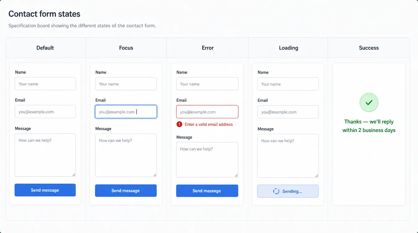
AI illustrationFigure: Form states: Default, Focus, Error, Loading, Success — AI-generated illustrative example (Magnific), not a real template or Framer screenshot.
State
Must show 🧠
Default
Visible label above each field ✅; placeholder only as an example
Focus
Visible ring on the field (≥ 3:1 against the surface)
Error
Red border plus a text message that says how to fix it ("Enter a valid email address") ✅ (not color alone)
Loading
Button disabled with a spinner or "Sending…" so it can't be double-submitted
Success
Plain confirmation that sets expectations ("We'll reply within 2 business days")
Localization view → Add Locale (language + optional region + fallback language). Page text, titles, descriptions, and image alt text show up in the Localization table, grouped by page.
Translate manually, or with AI Translation (uses plan credits). Manual translation never uses credits.
Preview locales on the canvas through the locale switcher. Translations can be edited on the canvas.
Pricing: localization is an add-on, $20 per locale (up to 20) on Basic/Pro ✅. The Free plan includes one free locale to try ✅.
Most templates should ship single-language (English). Locales cost buyers money.
Make the template localization-ready:
No text baked into images.
Layouts survive +30–40% text length (German/French). Buttons are fit-content and wrap gracefully.
Use CMS for content-heavy parts so localization flows through the CMS.
Avoid hard-coded date/currency formats in images. Keep them as text.
Offer an "international" template variant only for niches where it matters (tourism, hospitality, cross-border SaaS). Then show a locale switcher component and list "Localization add-on required" in the listing.
Every page has a unique title (≤ 60 characters) and description (≤ 155 characters) ✅ (title + description per page required in best practices).
One h1 per page. Logical h2/h3 order ✅. Semantic frame tags: header, nav, main/article, section, footer ✅.
Utility pages:/instructions, /style-guide and legal placeholders should be hidden from search engines 🧠.
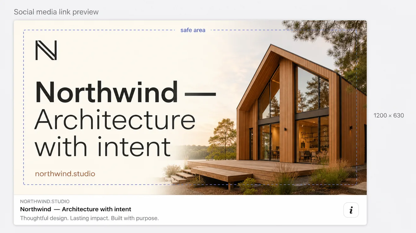
Social image: a site-level 1200×630 branded image, plus per-CMS-item cover binding ✅.
Favicon + touch icon set.
Internal links: nav, footer, related items, breadcrumbs on detail pages.
Slugs: short, lowercase, keyworded. CMS slug field filled for every item.
AEO (answer-engine optimization) 🧠: FAQ sections with direct answers, clear entity statements in About pages, and optionally an llms.txt generated with Framer's skill ✅ (skill exists).
🧠 Note for the instructions page: buyers must re-do SEO for their brand. Give them a 5-step SEO setup list.
🔎 Deep dive — social image and meta, worked example
AI illustrationFigure: 1200 × 630 social image with a centered safe area — AI-generated illustrative example (Magnific), not a real template or Framer screenshot.
🧠 Example metadata for a template's pages (rewrite per brand; length limits from 17.2):
Page
Title (≤ 60)
Description (≤ 155)
Search
Home
Northwind — Architecture Studio in Portland
Residential and cultural architecture shaped by light, timber, and climate. See selected projects and book a studio visit.
Show
Work (CMS index)
Projects — Northwind
Houses, cabins, and public spaces designed by Northwind since 2014.
Show
Work detail
{{Title}} — Northwind
{{Summary}}
Show
Blog detail
{{Title}} – Journal
{{Excerpt}}
Show
Instructions
Getting started — Northwind template
Setup guide for buyers.
Hide
Style guide
Style guide — Northwind template
Colors, type, and components.
Hide
Safe area 🧠: keep the logo and headline inside the middle ~1000 × 520 of the 1200 × 630 image, because some platforms crop the edges.
Upload as-is, Resolution Auto. Framer resizes (512/1024/2048/4096), converts to AVIF (q80) or WebP, adds srcset, and lazy-loads below ~1000px
SVG
Simple SVGs fine (SVGO-optimized). Complex SVGs → use as image fill
Fonts
Google Fonts preferred. Weights 300–800. Re-upload pre-Nov-2023 custom fonts
Video
Prefer YouTube/Vimeo components (adaptive). Avoid autoplay. Muted, looped, no-controls videos lazy-load and play only when visible. Framer serves self-hosted video at original resolution
Effects
Appear for top-of-page elements. No scroll animations there
Shadows/blur
Use sparingly. Blur < 10
Embeds
HubSpot forms, Spline 3D, etc. slow sites. Test removal on a duplicate
Custom code
defer/async. Page-level only where needed
Status
Site Settings → Versions: latest version should say Optimized (not "Optimization Error")
Self-hosted hero video ≤ 3–5 MB, 720–1080p, H.264/WebM, with a poster image. Otherwise use Vimeo/YouTube ✅.
Lottie/Spline: one signature moment max, below the fold, or loaded on interaction.
Note: the Free plan caps uploads at 5 MB per file ✅. Keep assets under that so buyers on any plan can remix without problems 🧠 ⚠️ (check whether the limit applies to remixed content).
Accessibility panel: semantic tags for text (auto from text styles) and frames (article, footer, header, nav, section), image alt text, custom tab order.
Reduced motion site setting: disables parallax, transform, and layout animations (and custom cursors) for users who prefer reduced motion.
Contrast: check with Chrome Lighthouse ✅.
Videos without audio: describe the content below the video ✅.
Skills Index has an Accessibility check skill ✅. Agents can audit accessibility issues ✅.
19.2 Template a11y rules (WCAG 2.2 AA baseline) 🧠✅#
Contrast: 4.5:1 body, 3:1 large text and UI components, in light and dark modes ✅.
Keyboard: every link, button, menu, accordion, tab, and form field is reachable and operable by keyboard. Logical tab order ✅.
Focus visible: never remove focus outlines without a styled replacement.
Semantics:nav around navigation, header/footer tags, section for sections, article for blog/case bodies ✅.
Headings: one h1, no skipped levels ✅.
Alt text: meaningful on content images, empty on decorative ones ✅.
Links: descriptive text ("View case study: Kinfolk Rebrand", not "Click here"). Icon-only buttons have accessible names.
Forms: visible labels, error messages in text (not color alone) ✅.
Motion: reduced-motion setting enabled. No flashing content more than 3 times per second.
AI illustrationFigure: Focus order, contrast, accessible names, tap targets — AI-generated illustrative example (Magnific), not a real template or Framer screenshot.
🧠 15-minute manual a11y pass:
Keyboard: Tab from the top of Home. Every stop has a visible ring, the order matches reading order, the mobile menu opens with Enter and closes with Esc, and focus never gets trapped.
Zoom: 200% browser zoom on Home and a CMS detail page. No overlapping or clipped text.
Reduced motion: turn on the OS setting and reload. Parallax, transforms, and layout animations stop ✅ (Framer's site setting), and nothing important is hidden behind an animation.
Screen reader spot check (VoiceOver: ⌘F5 on macOS): the rotor's headings list shows one h1 and a sensible outline; landmarks show header, nav, main/sections, footer.
Contrast: check Text/Secondary on Surface/Raised in both modes, the usual weakest pair.
On-brand message, search or key links, button home. Uses the layout template
Privacy Policy
🧠 MUST if forms exist
Clearly labeled sample text: "Replace with your own policy"
Terms
🧠 SHOULD
Same disclaimer
Cookie notice
🧠 MAY
Only if the template ships analytics/cookies (preferably it doesn't)
Instructions / Getting Started
🧠 MUST
See 21.3. Noindexed
Style guide
🧠 SHOULD for Premium
Live display of color styles, text styles, buttons, components. Helps buyers and the Agent
Changelog
🧠 SHOULD
Versions + dates (4.6)
Coming soon / Password / Thank-you
🧠 MAY
Niche-dependent (launch templates, forms)
Framer Academy has lessons on creating a custom 404 page and a "prelaunch checklist" ✅ (lesson titles exist).
🔎 Deep dive — utility pages, illustrated
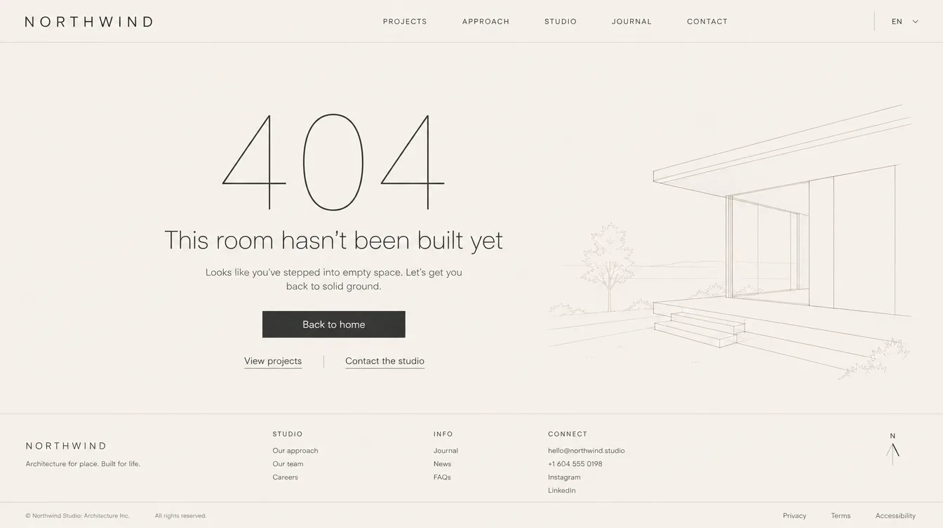
AI illustrationFigure: Custom 404 that uses the layout template — AI-generated illustrative example (Magnific), not a real template or Framer screenshot.
404 spec 🧠: same layout template (nav + footer) ✅; one human headline in the brand's voice; one line that says what happened; one primary button home plus 2–3 links to the most useful pages (Work, Contact, Blog); no auto-redirect; hidden from search.
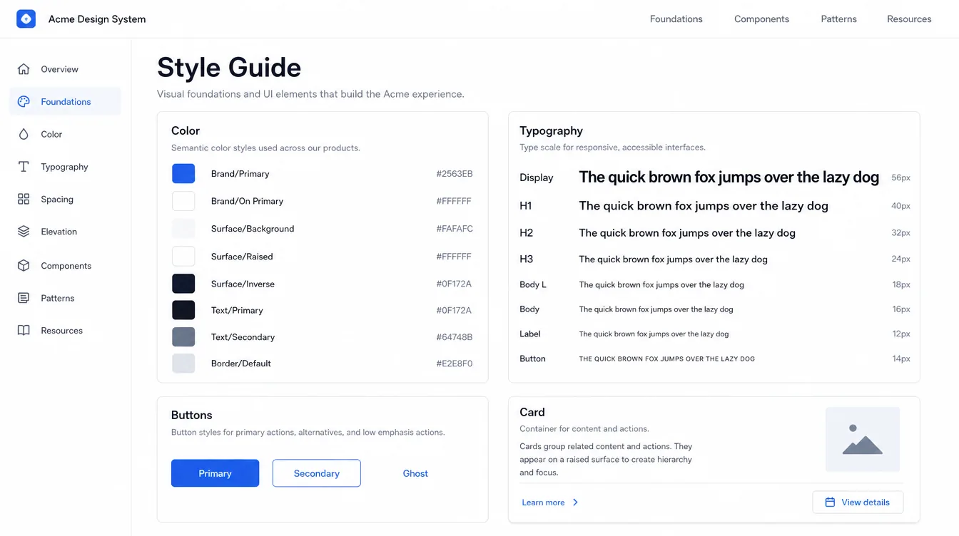
AI illustrationFigure: Style guide page (noindex) for buyers and the Agent — AI-generated illustrative example (Magnific), not a real template or Framer screenshot.
Style-guide page contents 🧠: every color style (name + light/dark value), every text style (live specimen + size per breakpoint), all button variants and states, every card component, form fields in all states, and the spacing scale. Because it uses the real styles and components, it updates itself when the buyer rebrands, and the Agent can be pointed at it (@page Style Guide, as in 21.4).
"An AI-ready template has clean structure, reusable components, consistent styles, organized CMS collections, and clear guidance for how it should be customized. It should be easy for both people and AI to understand."
Creators can add custom instructions that guide the in-canvas Agent: what to change, what to preserve, how to extend pages, and how to adapt the brand for different industries ✅.
Skills stay with a project when remixed ✅. They can reference @page, components, and styles. Create them with /skills or Settings → Skills. The Agent can apply a skill automatically when its description matches the task ✅.
Framer provides a demo /design-system skill project. The Skills Index offers copyable skills (Design system, Motion, Launch checklist, Accessibility check, Tidy up, CMS check, Form audit, SEO check, Page metadata, Brand voice, Remove AI writing, Create llms.txt) ✅.
Buyers should be able to rebrand in under 10 minutes:
Colors: edit Brand/Primary (+ Hover/On Primary) and the Surface/Text set. Everything updates.
Fonts: change the font family in ~2 groups of text styles (display, body).
Logo: one Logo component used in nav, footer, and favicon instructions.
Radius / style feel: buttons and cards draw from components, so one edit propagates.
Content: CMS for repeating content. Component properties for section copy.
Test this yourself: rebrand the template to a different industry in 10 minutes. Anything that took longer is a fix.
21.3 Instructions page template (ship in every template) 🧠#
text
# Getting started with [Template Name]  (v1.0.0)
1. Rebrand in 5 minutes
   - Colors: Assets → Color Styles → edit Brand/Primary …
   - Fonts: Assets → Text Styles → change Display + Body family …
   - Logo: edit the "Logo" component …
2. Edit content
   - Pages vs CMS: which sections come from which collection
   - Component properties: select a component → right panel
3. Forms → set "Send To" to your email/Sheets/webhook
4. SEO → Site Settings title/description, social image, per-page meta, CMS {{Title}}
5. Publish → connect domain (requires a paid plan); Basic vs Pro requirements: [collections/pages]
6. Using the Framer Agent
   - This template includes the /[template-name] skill. Try: "/[template-name] add a Careers page with 3 roles"
7. Fonts, images & licenses: what is included and what you must replace
8. Support: [email], response time [e.g., within 2 business days], refund policy link
9. Changelog
→ Delete or unpublish this page before going live (it is noindexed by default).
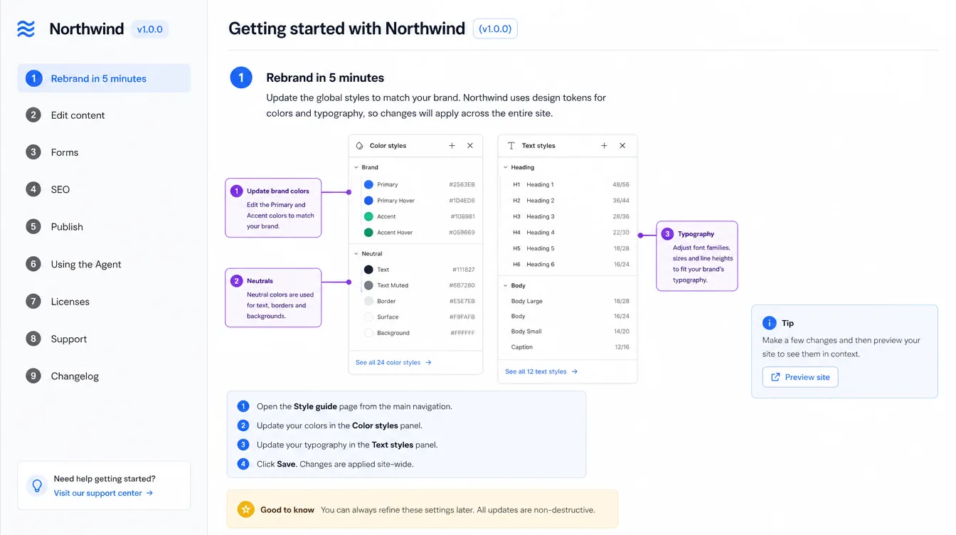
🔎 Deep dive — what the Instructions page looks like
AI illustrationFigure: Instructions page laid out as numbered steps — AI-generated illustrative example (Magnific), not a real template or Framer screenshot.
🧠 Layout tips: numbered steps in a sticky sidebar that match the outline in 21.3; one screenshot per step taken from the template itself; a "Plan requirements" callout at the top (Basic vs Pro); the support email and changelog at the bottom. Keep it under ~1,500 words. Anything longer belongs in the template Skill.
21.4 Template Skill starter (paste into Settings → Skills, edit per template) 🧠#
text
Title: [template-name]
Description: Use when adding or editing pages, sections, or CMS content in the [Template Name] template.

Content:
You are extending the [Template Name] design system. Never invent new colors, text styles, or spacing.
Pages
- Apply the "Main" layout template to every new page. Set a unique meta title and description.
- Sections fill width (1fr) and contain a "Container" with max width 1200px.
- Use @page Style Guide as the source of components; reuse section components before building new ones.
Colors: only Brand/*, Surface/*, Text/*, Border/* styles. Brand/Primary max once per section.
Typography: only text styles Display, H1–H6, Body L, Body, Body S, Label, Button. Sentence case. Text balance on headings. 50–75 chars per line.
Spacing: use 8/16/24/32/48/64/96/120 only. Section padding 120 desktop / 96 tablet / 64 phone.
Motion: Appear fade+rise 20px, 500ms, stagger 80ms, once. No scroll effects above the fold. Blur < 10.
CMS: new projects go to the Projects collection; always fill Cover Alt, SEO Title, SEO Description.
Preserve: hero composition, nav/footer, the signature [describe] effect.
Before finishing: check all breakpoints, no horizontal scroll, headings in order, alt text present.
Required for every template. Publish the project and paste the free Framer domain URL into the Community composer.
It must come from the project that contains the template you're selling and accurately represent what buyers get.
Republishing updates what visitors see.
🧠 Use a clean subdomain such as templatename.framer.website. Keep the Instructions page reachable but unlinked, or unpublished for the preview.
🧠 No "Buy this template" banners inside the template itself (best practice: remove ads/unrelated promotions ✅). If you want a purchase CTA on the preview, add a small floating badge to the preview only, and remove it from the remix source ⚠️ (judgment call. Many creators do this. Keep it unobtrusive).
Use the same background, frame style, and type across all images so they look like a set.
Only show what's in the product ✅ (accurate previews).
No fake "Bestseller" badges, no misleading claims.
🔎 Deep dive — listing media, illustrated
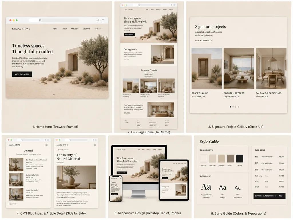
AI illustrationFigure: First listing image: browser-framed hero, readable at thumbnail size — AI-generated illustrative example (Magnific), not a real template or Framer screenshot.AI illustrationFigure: A cohesive 6-image listing set following 22.3 — AI-generated illustrative example (Magnific), not a real template or Framer screenshot.
🧠 Export recipe for exact 4:3 media (per the ⚠️ spec in 22.2): build each listing image as a 1600 × 1200 frame on a separate canvas page (or in your design tool) and export at 2× → 3200 × 2400, which is exactly 4:3. Keep the browser frame at the same position and scale in every image, use one background color, and leave ~8% margin so nothing important is cropped in thumbnails. Check the thumbnail by viewing the image at 400px wide: the template name and headline should still be readable.
Byline (one line): "[Who it's for] + [outcome]". Example: "A refined website template for architecture and interior studios to showcase projects and win clients."
Description structure:
text
[Hook — the buyer and their problem, 1–2 sentences]
Highlights
• 10 pages incl. Work (CMS) + Journal (CMS)
• Light & dark mode via color styles — rebrand in minutes
• Fully responsive, accessible, Lighthouse 90+ mobile
• Native forms, Dynamic Filters, smooth native effects
• Framer Agent skill included for on-brand page generation
Pages: Home, About, Services, Work, Work Detail, Journal, Article, Contact, 404, Legal
CMS: Projects, Posts (works on Basic plan — 2 collections)
Requirements & limitations: [plan needs, fonts, external services]
Support: [email], replies within 2 business days · Refunds: [policy summary + link]
License: one license = one website (Framer Single-Use Commercial License)
Changelog: v1.0.0 — [date]
Categories: the most accurate one. Style tags (e.g., Minimal, Dark, Animated). Feature tags (e.g., CMS, Forms, Scroll Effects) ✅.
Add a personal launch post when publishing. It goes to your followers and can help in For You/Hype feeds ✅.
Framer does not process payments. "Purchase" redirects to your checkout URL. Any platform with a direct payment link works (Framer names Contra, Stripe, Gumroad).
Checkout requirements: direct to payment, product + price shown, price = listing price, public with no login, refund/cancellation policy shown.
Deliver the remix link (and instructions) after purchase. A confirmation email is optional but recommended ✅.
🧠 Automate it: put the remix link in the platform's post-purchase "content"/receipt plus an email with the Getting Started steps, support email, and license summary.
🧠 Remix links can be forwarded. The license forbids sharing (§7.3.2). Report misuse to abuse@framer.com ✅.
Framer doesn't issue refunds. Buyers contact you. If you don't respond within about a week, they can contact Framer Support with proof of contact, and Framer will "help facilitate communication" ✅.
🧠 Suggested policy: "Because templates are digital and copied instantly, sales are final. We'll gladly refund within 14 days if a critical bug prevents use and we can't fix it within 5 business days." Show it on checkout ✅ (required).
🧠 EU consumer law can give a 14-day withdrawal right for digital content unless the buyer explicitly waives it at checkout. Use an MoR that handles this, or get advice ⚠️.
Keep a valid support email and respond within a reasonable timeframe ✅ (Terms §4.1).
🧠 SLA: acknowledge within 24h, resolve within 2 business days. Use canned replies for the top 10 questions (domain connection, plan limits, forms destination, fonts, CMS editing, updates, license, refunds, Agent use, dark mode).
🧠 Log every support question. If one comes up three times, fix the template or the Instructions page.
🧠 Tip: Framer Agents can audit broken links, accessibility issues, and inconsistent styling ✅. Run those audits (plus the Launch checklist skill) before your manual pass, then do the manual pass anyway.
Framer's guidance: create a Community post when you publish. Share context that isn't in the listing (process, inspiration, lessons). Ask for feedback. Reply to comments. Publish consistently. Consider timing for active hours ✅.
📊 Timing data: Tuesday is the busiest day for new templates and Sunday the quietest (weekends about 27% fewer). A weekend launch means fewer competitors in Recent. Its effect on sales is unknown.
Launch-day sequence 🧠
Publish listing + Community post (process story, 2–3 visuals or a short video).
X/Threads/LinkedIn thread: a 30–60s walkthrough video, the "why," and a link.
Email list / newsletter.
Submit to galleries/directories (e.g., Frameplate, Gallereee, Landbook, Minimal.Gallery, Dark.design, Awwwards market). Check each one's terms and costs ⚠️.
Your own site: a dedicated template page targeting "[niche] Framer template" searches.
Reply to every comment within 24h for the first week (early engagement feeds Trending/Recent ✅).
Framer: "Keep templates up to date, using new Framer features when they improve the experience" ✅. Best sellers do this visibly 📊.
Cadence: PATCH within 72h of a confirmed bug. MINOR quarterly (new page, a new native feature like Dynamic Filters, a better Agent skill). Re-audit after every major Framer release.
After every update: republish the preview, update the changelog, refresh listing images if visuals changed, email buyers, and post an update in the Community (fresh activity) 🧠.
Catalogs earn more steadily than single hits. Dmitrienko and Ehsan built 20+ product catalogs plus all-access bundles 📊.
Build families: shared design DNA across a niche (e.g., "Studio" line: architecture, interior, landscape).
All-access bundle priced at about 2.5–4× a premium single, including future releases. Sell it on your own site plus checkout platform.
Cross-sell: Instructions page and delivery email mention related templates (not inside the template's public pages ✅, since ads/promos must be removed).
Creator Program enrollment is automatic once you publish a template. Links live in the Links tab of Community profile settings, powered by Dub, paid through Stripe.
Payouts are monthly, cover commissions from two months earlier, and need a $200 minimum. Conversions stay pending 30 days. Commissions can be adjusted if the referred customer cancels within the first year.
Rewards are based on the amount the referred user actually paid (credits/discounts reduce them) ✅.
Taxes are yours. If Stripe isn't available in your country, Framer suggests options like a US LLC or a Wise-based Stripe-compatible account (get advice) ✅.
Affiliate links may be included in free templates ✅. No paid ads using affiliate links ✅.